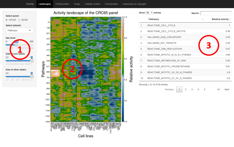
Purpose of the analysis:
Which pathways/kinases are hyper-active in a specific cell line(s).
Control panel to select cell line panel, dataset, sea levels and other display parameters.
Then a rectangle could be drawn from the heatmap. Most often we want to select the islands from the landscape, which are the hyper-active pathways/kinases in specific cell lines. To know which pathway/kinase are most active in one cell lines, users can select a single column in the heatmap.
The corresponding pathways/kinase will be shown and ranked by the relative activity (the higher the value, the higher the activity of the pathway/kinases).
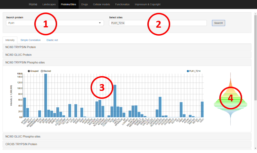
Purpose of the analysis:
Which protein or phosphorylation site is highly abundant in which cell lines.
Selecting the protein of interest.
Selecting the protein or measured phosphorylation sites of the protein.
The intensities of the selected protein/sites will be shown as barplot on the bottom.
The overall distribution of all measured intensities in a dataset is shown as the vioplot, every green horizontal line indicates an intensity of the protein/site. This plot can be used to evaluate where the measured intensities are located regarding all measured intensities.
Give a protein or its phosphorylation sites, to annotate the biological functions associated with them (related to the hive plot in the paper)
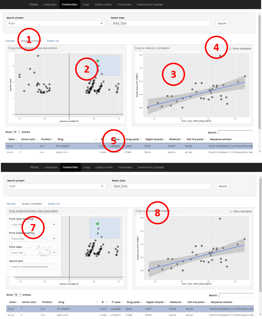
Purpose of the analysis:
Given a protein or phosphorylation site, to explore which drugs are associated with it.
The drugs whose responses are correlated with protein/site abundance could be explored from the tab “Simple correlation”.
The results are first displayed as a volcano plot where the x-axis is the Pearson correlation coefficient of drug responses and protein intensities and the y-axis is the log-transformed p-value. Each point is a drug. Rectangle could be drawn to select drugs, often we want to know the drugs on the top left and top right corner.
To evaluate how the drug responses and protein intensities are correlated, the user can click on one point in the volcano plot. The protein intensities and drug responses will be shown.
The correlation coefficients were calculated based on measured values, user can also check the checkbox to get the drug response data in cell lines without intensity information for the select protein/sites.
More information about drugs included in the rectangular in the volcano plot will be displayed as tables on the bottom. Clicking a row will update the correlation plot on top right accordingly.
Users can use the search box to find out whether the drugs of interest were selected from the volcano plot.
In addition, the appearance, such as color, label, etc, could be changed using the dropdown menu. In addition, the user can also search for drugs by the drug name using the “Search text” function.
A similar dropdown menu is also implemented for the correlation plot of drug responses and protein/sites intensities.
The drug-protein/sites interaction discovered by elastic net method could be explored using the “Elastic net” tab. The layout is similar to the “Simple correlation” tab.
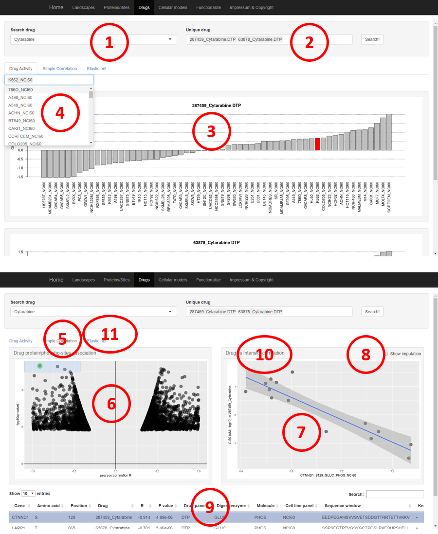
Purpose of the analysis:
Given a drug, to explore which proteins or phosphorylation sites may be associated with its sensitivity or resistance.
Selecting the drug of interest
One drug could be studied in multiple drug panels, selecting the drug panel to explore here.
The drug responses will be shown as a barplot on the bottom.
The search box could be used to high the drug response of specific cell lines.
The protein/sites whose intensities correlated with the drug responses could be explored from the tab “Simple correlation”.
The results are first displayed as a volcano plot where the x-axis is the Pearson correlation coefficient of drug responses and protein intensities and the y-axis is the log-transformed p-value. Each point is a protein/site. Rectangle could be drawn to select protein/sites, often we want to know the protein/sites on the top left and top right corner.
To evaluate how the drug responses and protein/site intensities are correlated, the user can click on one point in the volcano plot. The protein intensities and drug responses will be shown.
The correlation coefficients were calculated based on measured values, user can also check the checkbox to get the drug response data in cell lines without intensity information for the select protein/sites.
More information about drugs included in the rectangular in the volcano plot will be displayed as tables on the bottom. Clicking a row will update the correlation plot on top right accordingly. There is a search box on the top left corner, the user can use it to look for specific proteins/sites.
In addition, the appearance, such as color, label, etc, of the volcano and correlation plot could be changed through the dropdown menu. In addition, the user can also search for protein/site or cell lines using the “Search text” function.
The drug-protein/sites interaction discovered by the elastic net method could be explored using the “Elastic net” tab. The layout is similar to the “Simple correlation” tab.
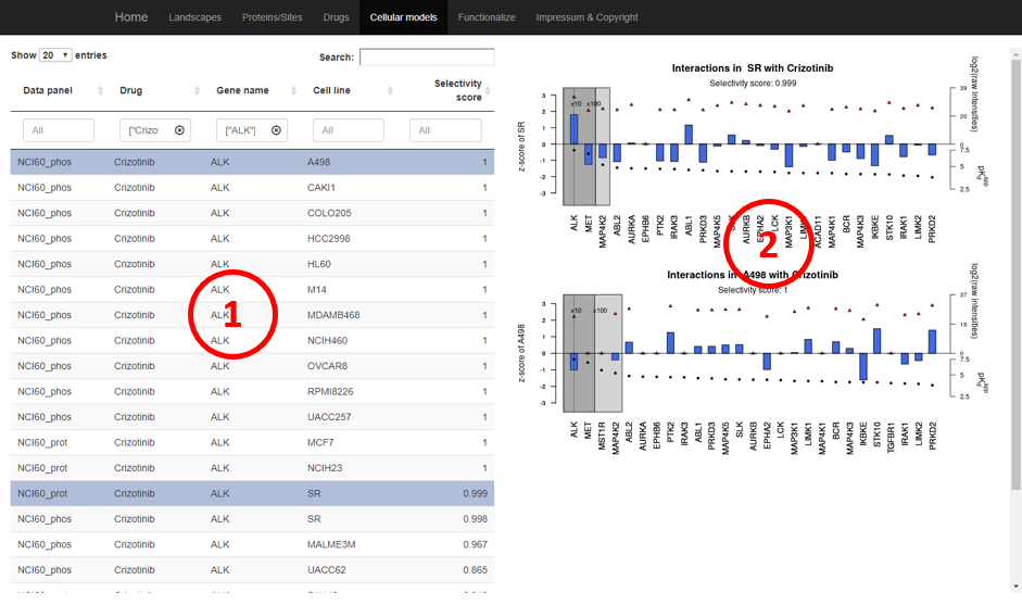
Purpose of the analysis:
Given a drug and knowing its main target, which cell line could be the proper cellular model to study the drug.
Selecting the drug of interesting from the “Drug” columns and its main target from the “Gene name” column. The cell lines are sorted according to their “selectivity score”. The selectivity score ranges from 0 to 1, 1 indicates a good cellular model to study the drug.
Click on one row will display a selectivity plot, which can be used for further evaluation of the selectivity score. Using the plot on top as an example, the targets of Crizotinib are ordered by binding strength (expressed by their pKdapp; log10 of the apparent Kd values; black dots; right bottom y-axis). The shaded areas enclose kinases whose pKdapp values are within 10-fold (dark gray) or 100-fold (light gray) of the pKdapp of the most potent Crizotinib target ALK (Supplementary Methods for additional details). The left y-axis shows the z-scored intensities of kinases targeted by Crizotinib across the NCI60 panel as bars and their log2-transformed intensities as red triangles (right top y-axis). It is apparent that ALK is relatively more abundant than the next best Crizotinib targets MET and MAP4K2. In fact, ALK accounts for 99.9% of the proteomic abundance of the top three Crizotinib targets (expressed as a selectivity score), making ALK inhibition by far the most likely molecular target explaining the sensitivity of SR cells towards Crizotinib. A related analysis provided by the ATLANTiC web application is to select a protein of interest first, and the output is a set of kinase inhibitors and cell lines along with the same selectivity score, which can guide the selection of a suitable cell line to study the drug/protein interaction in more detail.
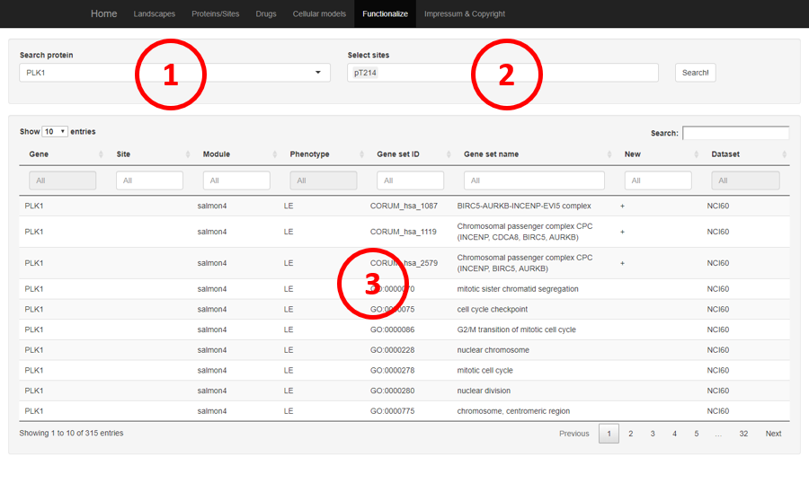
Purpose of the analysis:
Give a protein or its phosphorylation sites, to annotate the biological functions associated with them (related to the hive plot in the paper)
Selecting the protein of interest.
Selecting the site want to annotate.
Annotation table, columns are
Gene: the gene name of the protein
Site: the phosphorylation site
Module: which WGCNA module (named by color) was used to annotate the function of the protein/site
Phenotype: which phenotype is related to the WGCNA module, e.g. the protein/sites in salmon4 WGCNA module is highly expressed in leukemia cell lines (LE)
Gene set ID: The ID of gene set annotation of the WGCNA module
Gene set name: The name of the gene set annotation of the WGCNA module
New: whether the functional annotate is new, i.e. not in the gene set database